Andy Olivier, editor
HOW TO BUILD A BRAND THAT ACTUALLY SELLS

June 18
Trends Fade. Great Branding Doesn’t.
Trends come and go, but great design endures. In a world where brand aesthetics shift with every algorithm update, the most impactful brands are the ones that stay recognisable, consistent, and relevant year after year.
That’s the power of timeless brand identity design.
If your brand is more than just a moment, this guide will walk you through how to create a visual identity that doesn’t just look good now — it builds trust, recognition, and connection for the long run.
In this guide, you’ll learn:
1 - What Is Brand Identity Design (And Why It Matters)
Brand identity design is the visual language of your brand - the combination of elements like your logo, color palette, typography, and design system that work together to tell your story at a glance.
It’s more than “how your brand looks.” It’s how it feels, communicates, and positions you in the market.
A well-designed identity:
- Builds instant recognition
- Creates emotional resonance
- Communicates consistency and credibility
- Differentiates you from competitors
Timeless identity design doesn’t chase trends - it reflects a clear, strategic brand foundation.
2 - The Principles of Timeless Brand Identity Design
To create something that lasts, you need to anchor your design in strategy, not style.
Here’s what timeless brand identity design is built on:
a. Clarity Over Complexity
A strong brand identity doesn’t need to be loud or complicated. Clean lines, simple shapes, and intentional use of space go a long way.
Timeless brands like Chanel, Apple, and Nike are proof that minimal doesn’t mean boring - it means memorable.
b. Strategic Typography
Fonts tell stories. Choose typefaces that reflect your brand’s values - not just what’s trending on design blogs.
- Serif fonts: classic, trustworthy, elegant
- Sans-serif fonts: modern, clean, direct
- Display fonts: bold, distinctive, limited use only
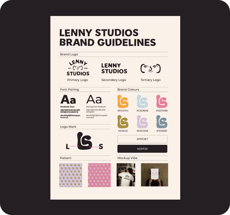
Use 2–3 fonts max across your brand — and define clear usage rules in your brand guidelines.
c. A Meaningful Colour Palette
Instead of just picking colours you like, choose ones that align with your brand psychology and emotional impact.
Think of:
- Longevity over novelty
- Versatility across digital and print
- Strong contrast for accessibility
Pro tip: Use no more than 1–2 primary colours and 2–3 secondary/supporting shades.
d. A Flexible Logo System
Your logo should work everywhere — from a billboard to an Instagram profile photo.
A timeless logo system includes:
- Primary logo
- Secondary/stacked version
- Icon/submark
- Monochrome versions for flexibility
3 - So, How to Build a Brand Identity That Lasts?
Step 1: Start With Strategy
Before you touch design, define your:
- Brand mission
- Core values
- Audience profile
- Market positioning
- Tone of voice
This forms the foundation of your visual language. Every color, shape, and typeface should align with your brand’s strategic core
Step 2: Moodboard & Creative Direction
Gather visual references that match your brand’s personality. This isn’t just about aesthetic — it's about emotion, tone, and brand energy.
Your moodboard should help answer:
- How should the brand feel at first glance?
- What kind of lifestyle, values, or emotion does it reflect?
Step 3: Design the Core Elements
- Logo: Build a clean, scalable design that works in multiple formats
- Typography: Choose a type system that feels authentic and legible
- Color Palette: Limit yourself to a core set of consistent, flexible colors
- Iconography: Optional, but helpful for digital navigation and brand depth
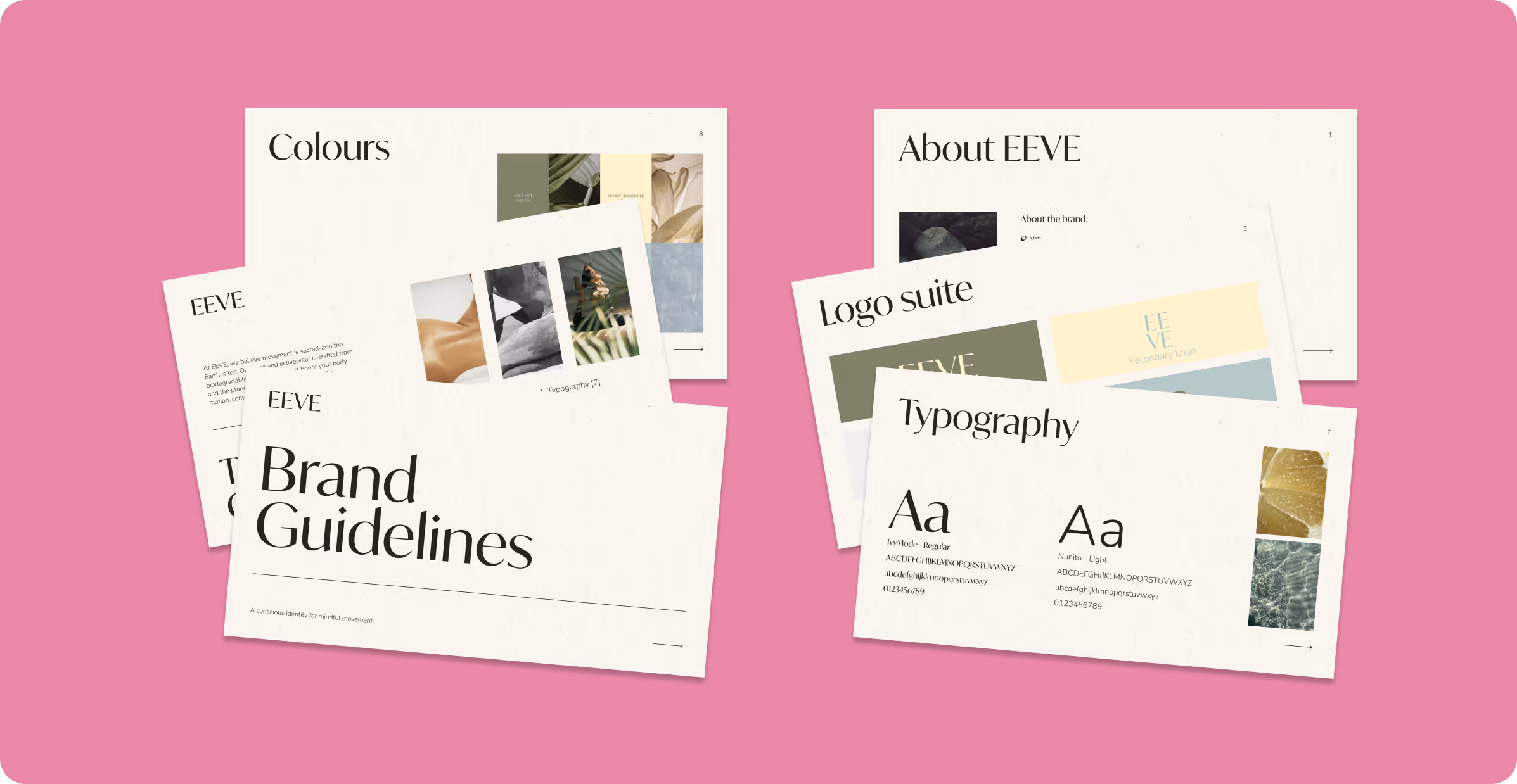
Step 4: Create a Brand Guidelines Document
Timeless design only works if it’s used consistently. A brand guide ensures that future content, web pages, social graphics, and packaging all align.
Include:
- Logo usage rules
- Color codes (HEX, RGB, CMYK)
- Font names and usage
- Do’s and don’ts
- Tone of voice notes (optional).
4 - Mistakes to Avoid in Brand Identity Design
Even great brands go wrong when they:
- Overcomplicate the logo with effects or trends
- Use too many fonts or colours
- Follow what’s trending instead of what’s true
- Forget about cross-platform performance
- Don’t document usage guidelines
Remember: Timeless doesn’t mean plain. It means intentional, strategic, and lasting.
5 - Final Thoughts
A timeless brand identity isn’t just a luxury - it’s a business asset.
Whether you're starting from scratch or rebranding, your visual identity should feel like a natural extension of who you are — today, tomorrow, and ten years from now.
Ready to build a brand with soul and strategy?
Let’s create something unforgettable.
Contact Lenny Studios